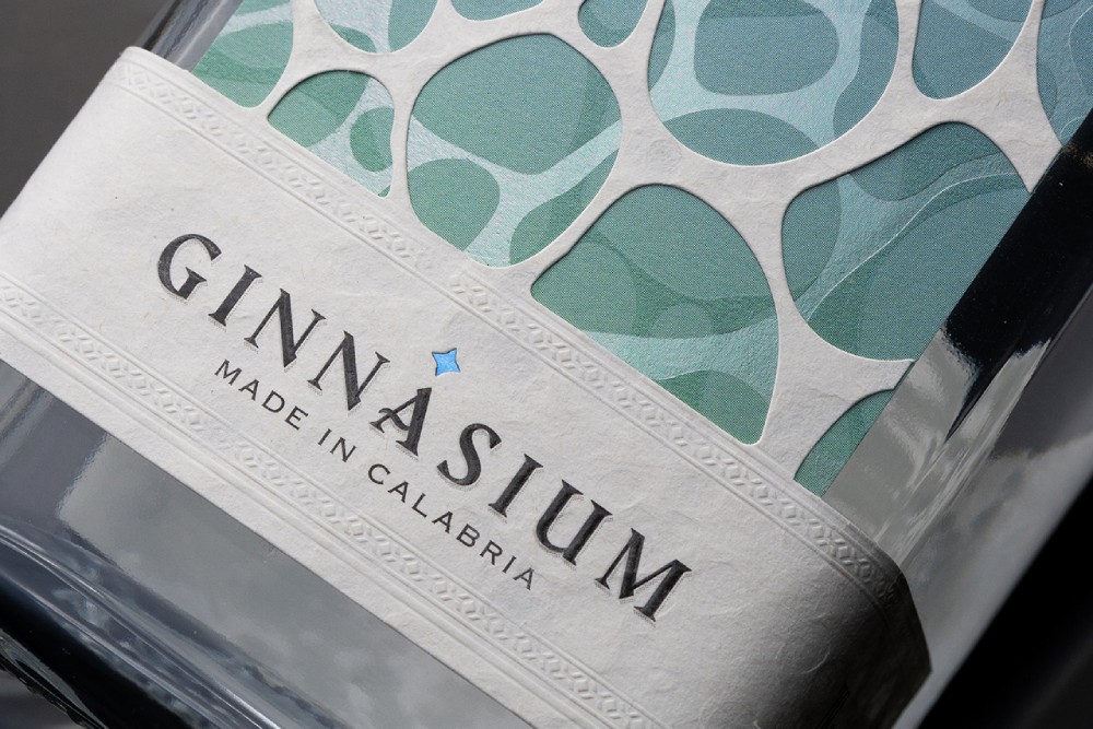
di Odore by Quint Creative
di Odore was born from the union of heritage, territory, and sensoriality.
ARQ8 redefines creatine packaging for wellness-conscious consumers. In a niche dominated by testosterone-driven aesthetics or generic neutrality, the challenge was to appeal to diverse audiences — from athletes to longevity-focused individuals — without compromising premium perception or scientific credibility.
MORNESS — premium whole bean coffee for discerning enthusiasts.
Naturare is a modern health and wellness brand focused on natural, weight-management, and lifestyle products designed for conscious consumers. We collaborated with Naturare to craft a complete visual identity and premium packaging system, supported by high-end 3D product modeling and photorealistic renderings. The project included packaging and label design for Nutritional Malt (Weight Control Management), …
FABLE is a luxury tea house that bridges 19th-century botanical heritage with contemporary design sensibilities. Rooted in the philosophy of “Nature, Edited,” the brand’s identity revolves around an anthropomorphic aristocrat, a distinguished bird guardian who embodies craftsmanship, refinement, and the stewardship of a premium tea blend.
The Yummix packaging is based on a rectangular shape that tapers toward the top. The box is sealed with a semi-circular element, evoking the image of a sliced piece of fruit. For easier transport and storage, the box can be folded flat. The packaging was created in three flavor combinations, each distinguished by a unique …
Yummix Dried Fruit by Hollóka Graphic Design Studio Read More »