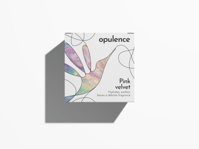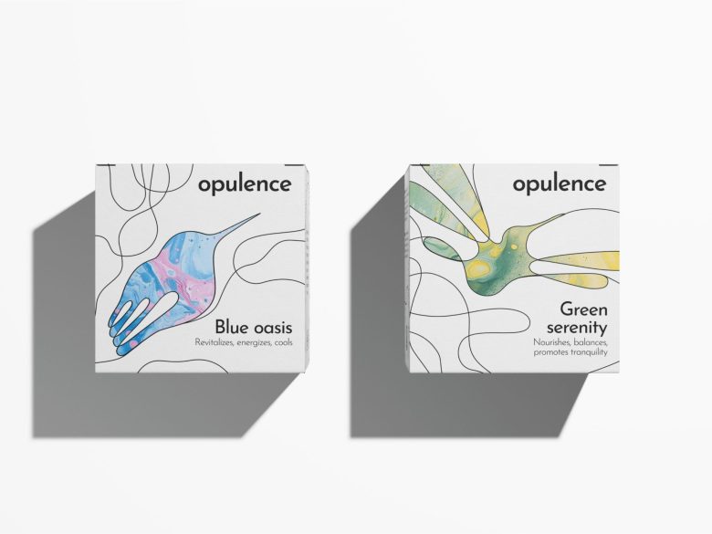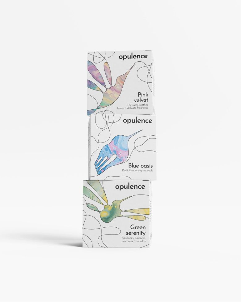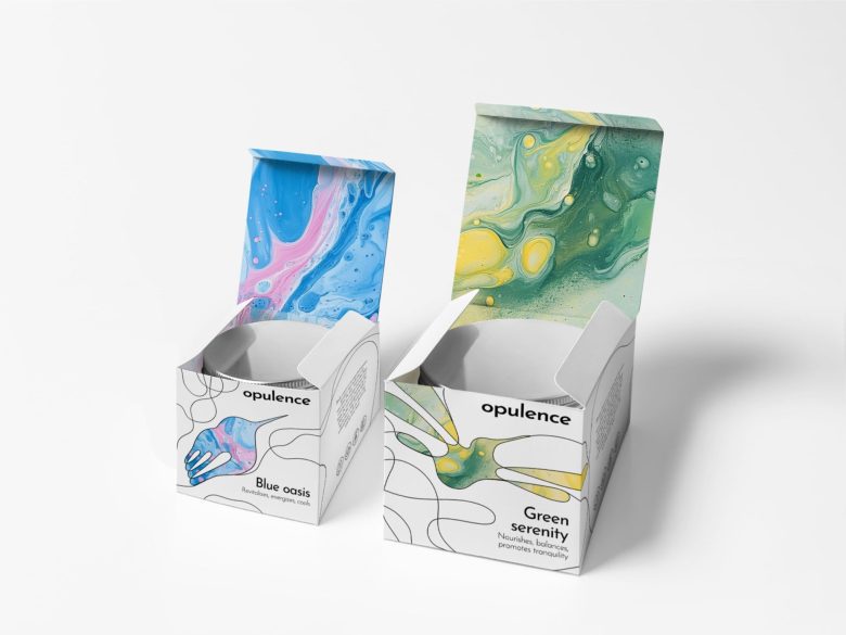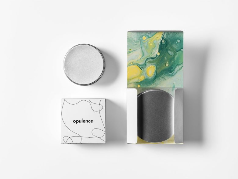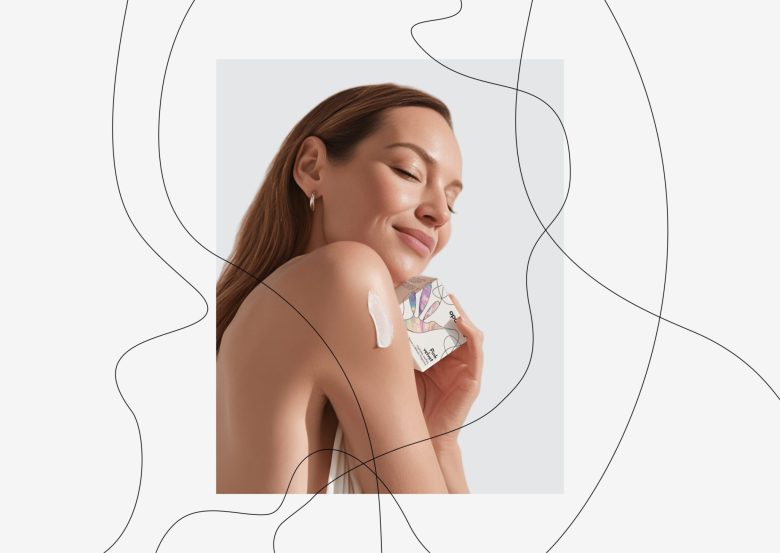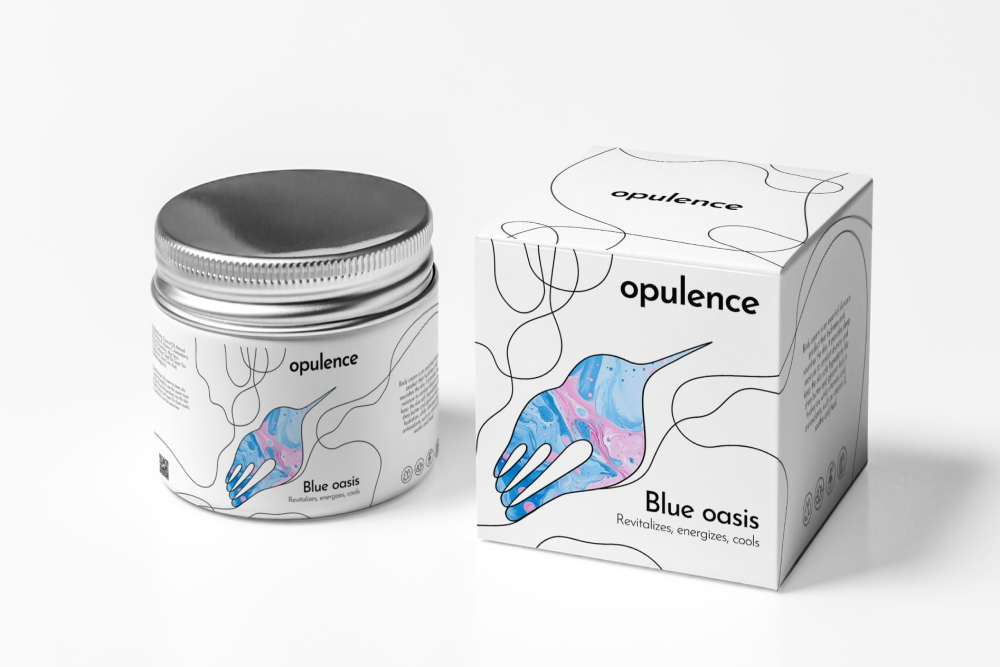
The body cream packaging exudes minimalist sophistication, brought to life through carefully curated design elements. Matte square boxes frame stylized hummingbirds drawn with continuous, flowing ink lines that glide effortlessly across the surface. These precise black contours give the illustrations a modern, graphic edge while maintaining an organic sense of movement.
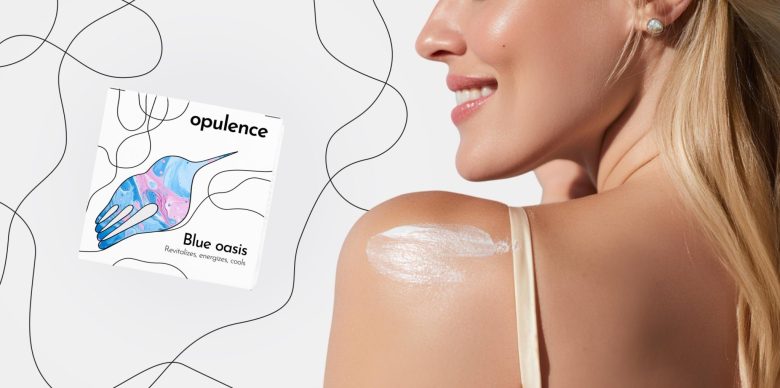
Inside these outlined forms, soft watercolor gradients shift from gentle pink to serene blue — colors blending as gracefully as the light at dawn. Delicate, feather-like strokes radiate from the hummingbirds’ wings, their tapered ends creating an impression of motion and weightlessness. This subtle detail evokes both the flutter of wings and the light, silky texture of the cream itself.
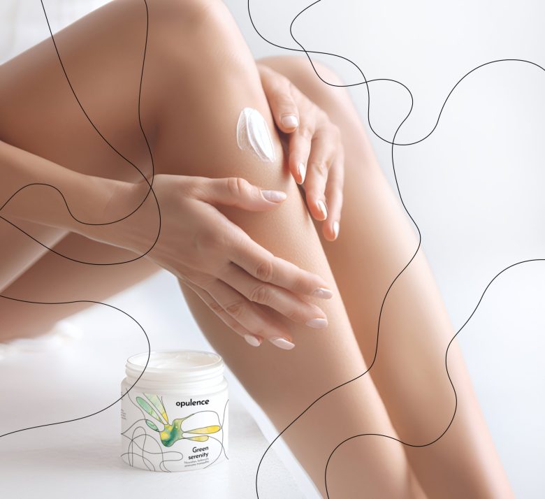
The packaging plays with geometric contrast — sharp-edged square boxes versus smooth, oval jars. The crisp lines and flat surfaces of the boxes provide a striking backdrop for the intricate hummingbird motifs, while the jars’ rounded shapes offer ergonomic comfort.
Three variants are featured:
“Pink Velvet” — with rich pink tones, designed to nourish dry skin.
“Blue Oasis” — in cool hues, to refresh tired skin.
“Green Serenity” — in vibrant green, to hydrate dry and sensitive skin.
Product names are set in clean, understated typography just beneath each illustration, letting the visuals take center stage. The overall aesthetic strikes a balance between graphic precision and natural softness — much like the creams themselves, which pair powerful formulas with gentle application.
Designed by Tatyna Koreneva
Via
