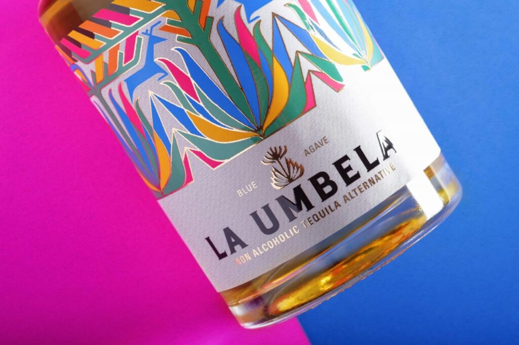
The project focused on creating a non-alcoholic tequila brand, offering a sophisticated and authentic experience for conscious consumers, without compromising on quality or the rich tequila tradition, through an innovative artisanal process.
Thus, “La Umbela” was born, a development that begins with a brand strategy for a growing category and an emerging market. This strategy materializes into a name and story that connect with consumer values and stand out from the ordinary, culminating in a design that draws from the deeply rooted tradition of the Tequilana Weber agave from Los Altos de Jalisco.
This tequila offers an alternative for those who want to enjoy the taste of agave without the alcohol content. With an initial focus on the British market, plans are set for expansion into the United States and the European Union.
This product is distinguished by its artisanal process, which preserves the authenticity of the agave by omitting distillation.
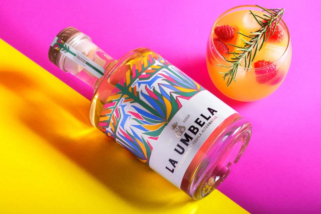
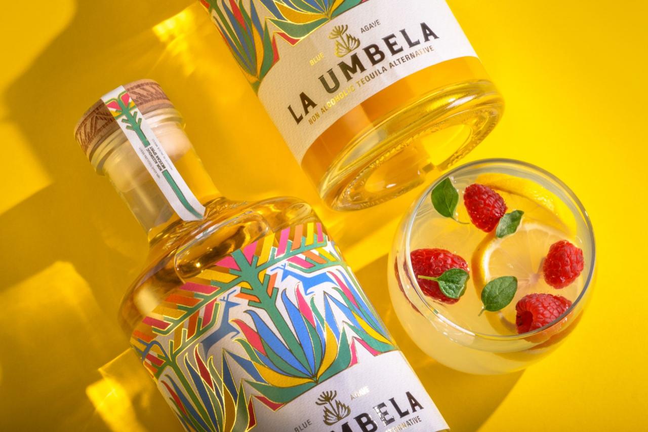
‘La Umbela’ involved a multifaceted design encompassing brand identity, the bottle, and packaging. The goal was to capture the authenticity of the agave through a premium aesthetic and emotional visual narrative in every aspect. The bottle design was conceived to convey the essence of modern Mexico, blending pre-Hispanic patterns and forms from the Wirarika culture of Jalisco with cosmopolitan sophistication, telling a unique visual story in every detail.
The bottle’s polychromatic label and the brand’s logo reflect the vibrant colors of Mexico, represented in an agave from which the stem of the flower known as ‘the Quiote’ emerges, crowned by the Agave Flower, forming a branching structure called ‘Umbela,’ from which the name originates. This element of the agave, seldom explored in tequila, symbolizes the culmination of the plant’s life, but in this case, represents the blossoming of a new category: ‘Non-Alcoholic Tequila.’
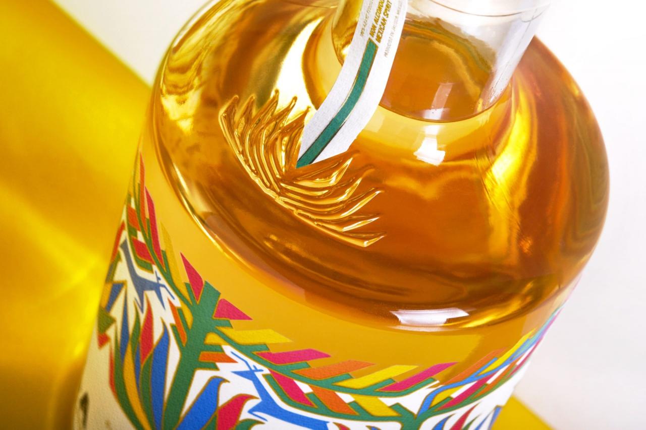
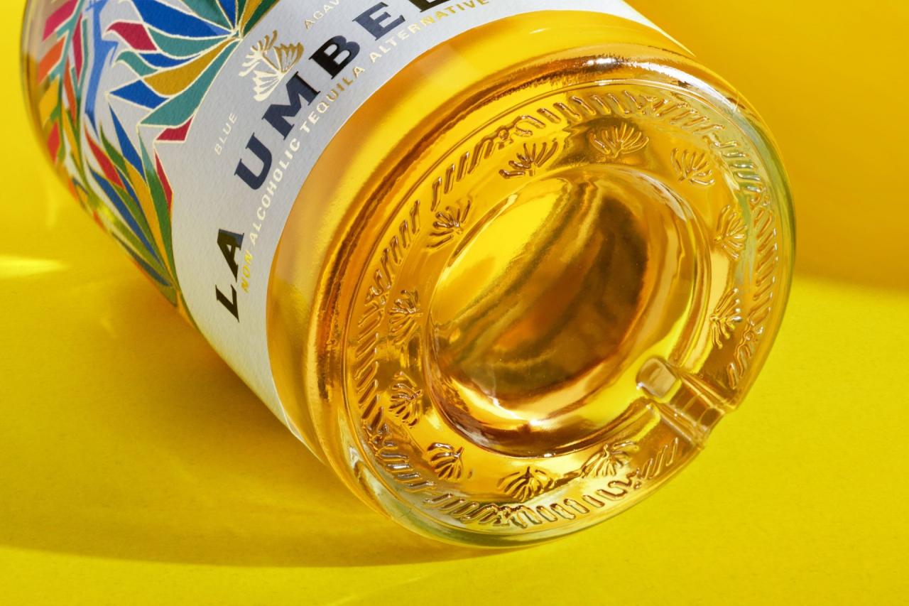
The story is reinforced with an embossed agave on the bottle, where the security seal is located, and connects with the engravings on the cap, which also represent ‘La Umbela.’ All of this is achieved by prioritizing sustainability, ethical production, and support for local communities. Every design detail communicates these values in a tangible and appealing way.
This comprehensive approach to brand design, packaging, and bottle communicates the authenticity, quality, and differentiation of ‘La Umbela’ in today’s market. By addressing challenges from multiple angles, this proposal creates a visual and tangible identity that stands out from the competition and resonates with consumers committed to quality and ethics.
Designed by Andrew Higareda
Via
