Portuguese winery João Portugal Ramos came to creative agency DAf in anticipation of launching a new red blend wine in the United States, and asked us to create a full concept for the wine, to appeal to Gen X and Millennial consumers in the US, keeping in mind that much of their target audience was not familiar with Portugal as a wine region or in general. They asked us to create a concept and world around this wine, with a captivating story based in Portuguese culture or history to educate people about Portugal at the same time as promoting the wine.
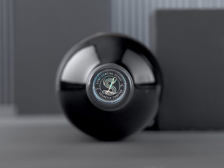
After extensive market research into Portuguese history and culture, we came across the importance of the area surrounding Lisbon as a nexus for spy activity during WWII, which we used to build a rich conceptual world, including storytelling, imagining a secret society that used hidden messages on the wine bottle and cork, and developed the name Spyland for the wine.
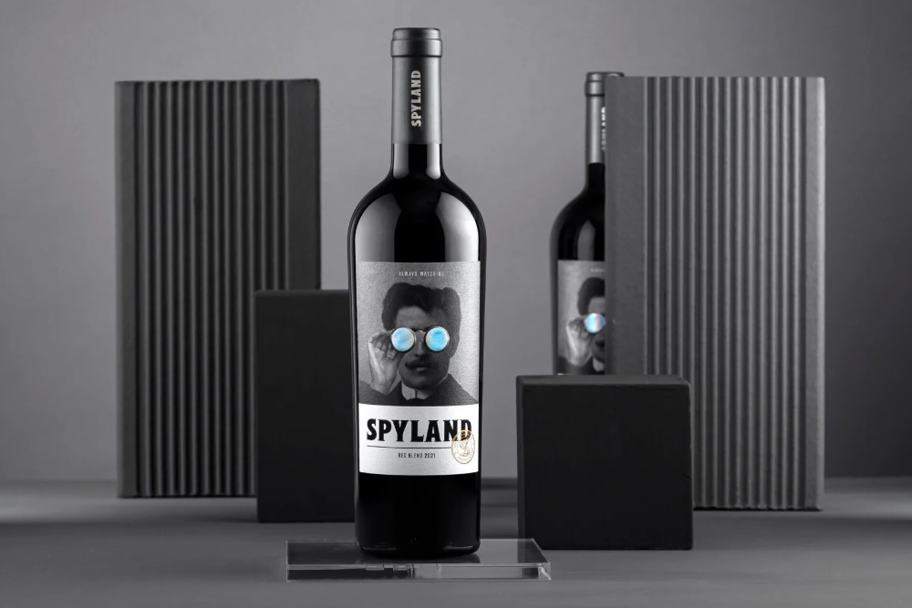
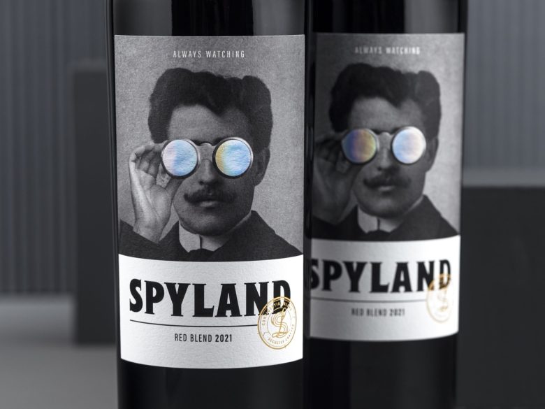
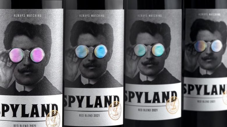
The wine’s packaging is printed in black and white, emulating a photograph from the era, depicting the spy, a young mustachioed man holding up an early iteration of binoculars to his eyes. The binocular lenses on the label are iridescent colors. Below the main character is the brand name and above him are the words “Always Watching.” On the lower right is a seal evocative of a wax seal or passport stamp, used to connote secrecy. We used a font adapted in-house from a bold san-serif print, expanding it and adding serifs to give more white space and expanding the counters within letters to yield a font that is sensual and bold, evocative and historic at the same time.
Paper: Adestor Vintack 8
Metallic Foil: Kurz Lite Line Laser AL
Printing: 4 color printing
Designed by DAf.agency
Via


