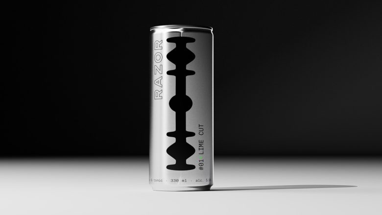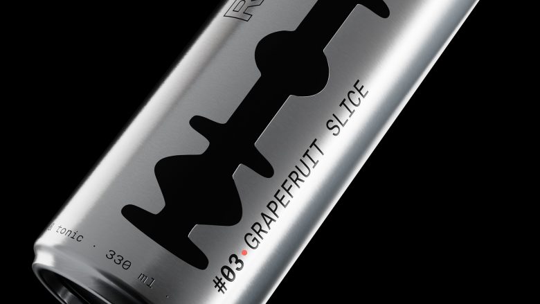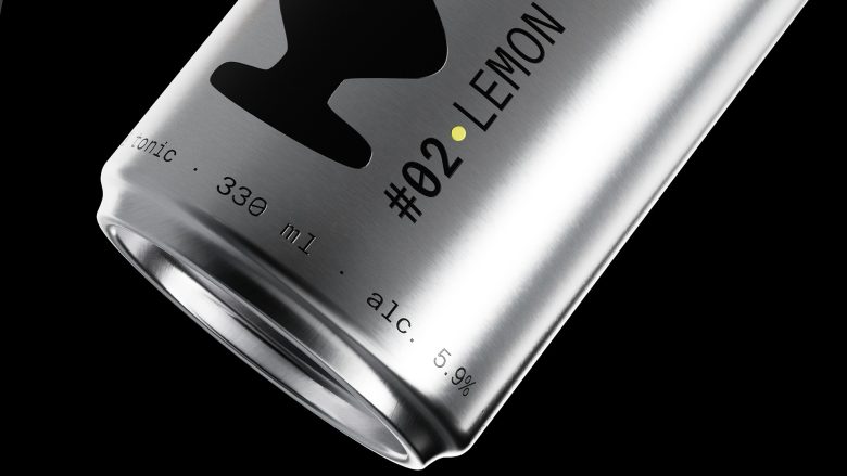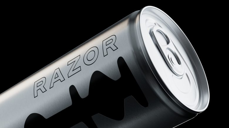
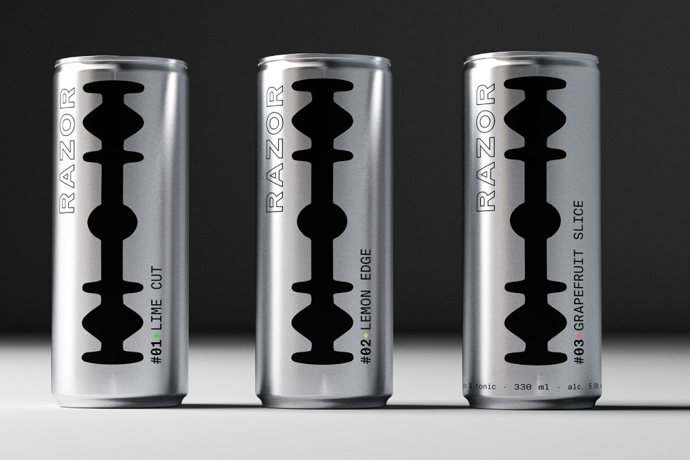
RAZOR is a ready-to-drink cocktail concept built around the visual language of precision, sharpness, and industrial purity. The aluminum can transforms the iconic silhouette of a razor blade into a bold packaging system for a premium gin & tonic line.
Curator’s Insight:
What makes RAZOR quietly confident is its restraint. The razor blade motif earns its place as structural logic, the blade’s notched spine doubling as a visual axis that organizes the entire label hierarchy. The single green pip next to “Lime Cut” is the only chromatic break in an otherwise monochrome system, and it carries the entire flavor identity without a single illustrative cue. That economy of color is a deliberate bet: that one pixel of green outperforms any fruit illustration. The vertically rotated wordmark running along the left edge adds tension without noise, reinforcing the sense that every design decision here was made by subtraction rather than addition.
Designed by mike katano
Via